CREATIVE ASSETS & DIGITAL LICENSES
Premium fonts, graphic templates, 3D illustrations, and official commercial licenses for professional creators, designers, and studios.
PROVEN STUDIO CREDIBILITY
Over 11+ years of publishing commercial assets across 34 global marketplaces & delivering custom design solutions to 57+ corporate entities worldwide.
Initializing S.A.T. Grid...
FEATURED FONTS
Preview of our top-tier foundry font releases. View full catalog for all assets and templates.
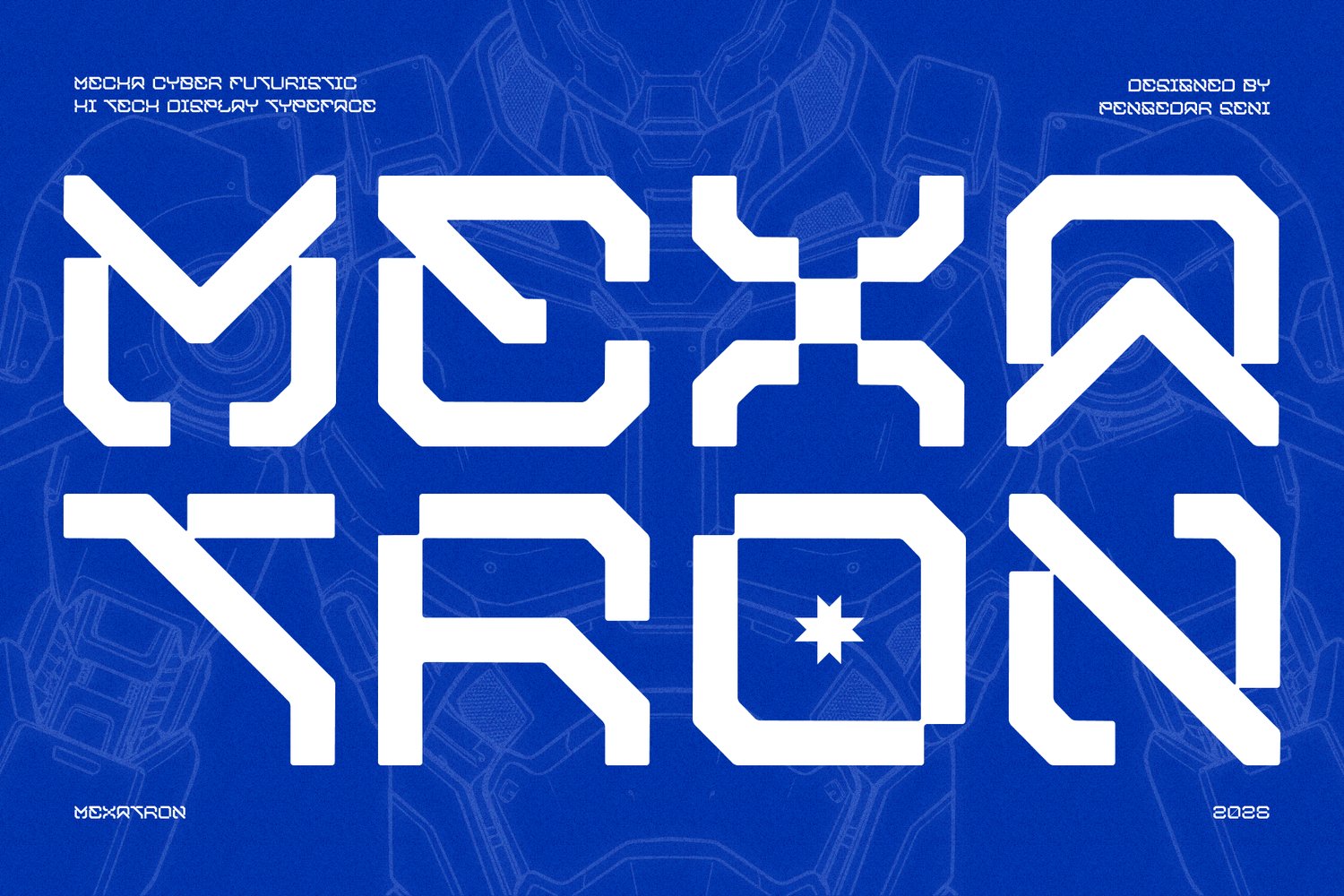
Mexatron – Sci-Fi Display Font
Mexatron - Sci-Fi Display Font Forged from steel and code. The ultimate typographic mobile suit. MEXATRON is a heavy-duty, cyber-futuristic display typeface engineered for the next generation of visual communication. Deeply inspired by mecha anime, advanced robotics, and dystopian industrial aesthetics, this font acts as the ultimate typographic armor for your creative projects. The Philosophy Behind MEXATRON ⚙️ Mexa (Mecha / Mechanical): Represents raw, physical power, heavy machinery, and the imposing structure of giant mobile suits. Tron (Electronic System): Symbolizes the digital core, the glowing UI screens, and the high-tech circuitry that brings the machine to life. Together, MEXATRON is the perfect synergy of hardware and software—a machine language built for human design. Technical Precision: 45° Angles & Fluid Bridges 📐 MEXATRON isn't just drawn; it's constructed. The letterforms are built on a rigid geometric grid, heavily featuring signature 45-degree angle cuts that mimic the aerodynamic armor plating of futuristic robots and spacecraft. To balance this aggressive industrial silhouette, the design incorporates a fluid bridge system—subtle, mathematically calculated smooth transitions at the joints. This prevents the font from feeling overly stiff, simulating the seamless, fluid movement of mechanical hydraulics and giving it a highly polished, premium tech finish. Why Choose MEXATRON? Extensive Multilingual Support: Equipped with a massive character set including Basic Latin, Extended Latin, and comprehensive Cyrillic glyphs, ready to deploy across global projects. Mecha Industrial DNA: The absolute best choice for sci-fi blueprints, HUD (Heads Up Display) interfaces, and mechanical schematics. Streetwear Ready: Perfect for tech-wear branding, cyberpunk apparel, and Y2K industrial hoodie designs. Striking Geometric Alternates: Features unique character constructions that look like coded alien technology or classified military insignias. Perfectly Deployed For: Mecha anime titles, sci-fi posters, synthwave album art, tech-wear clothing lines, esports team branding, futuristic gaming UI/UX, mechanical product packaging, and post-apocalyptic branding. Equip your design with MEXATRON and let your typography pilot the future.
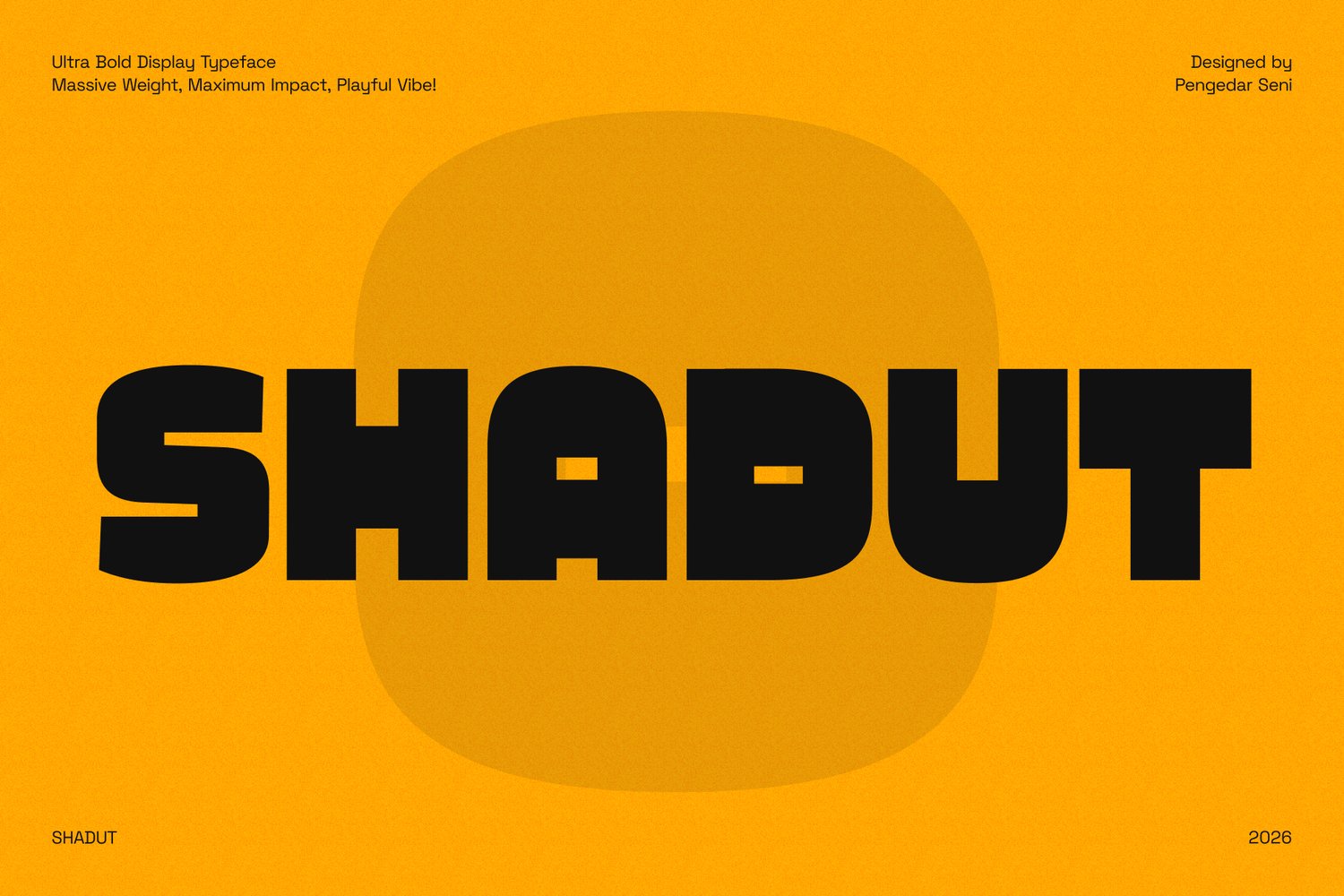
Shadut – Ultra Bold Display Typeface
Shadut – Ultra Bold Display Typeface Massive Weight, Maximum Impact, Playful Vibe! Shadut is a heavy, chunky, and ultra-bold display typeface designed to grab attention instantly. Its massive structure and subtly rounded corners give it a powerful yet approachable appearance. The name "Shadut" carries a quirky and playful ring to it—evoking a sense of being delightfully plump, bold, and full of character. Whether you want to be loud, playful, or edgy, Shadut is built to make a massive statement. 🎨 Why Choose Shadut? ✅ Ultra Bold & Chunky – Stands out effortlessly, making it perfect for giant headlines and striking posters. ✅ Solid yet Friendly – The subtle rounded edges soften its massive weight, giving it a fun and energetic personality. ✅ Extensive Character Set – Includes Basic and Advanced Latin character sets for robust multilingual support. ✅ Versatile Impact – Ideal for streetwear apparel, snack packaging, bold branding, game titles, and eye-catching social media graphics. Shadut brings heavyweight charm to your designs—where every word stands strong, solid, and full of character! ✨
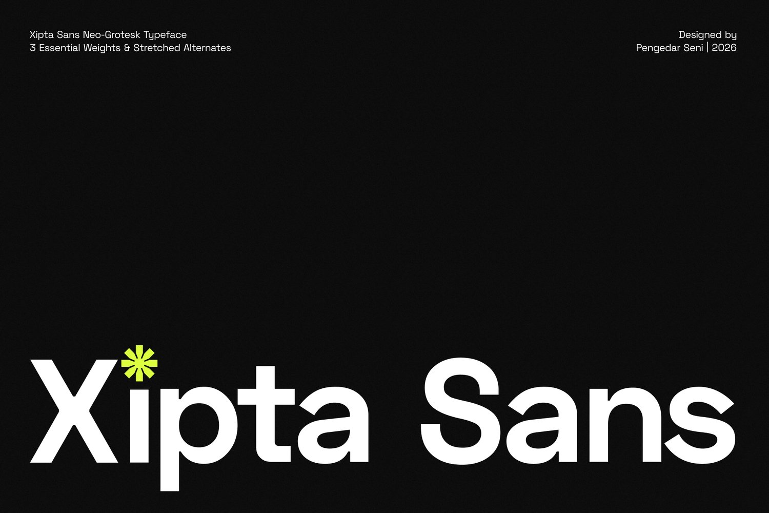
Xipta Sans – Neo Grotesk Typeface
XIPTA SANS – A Neo-Grotesk Typeface Built for Modern Creation and Infinite Possibility The structural blueprint for contemporary typography. Xipta Sans is a modern, neo-grotesk typeface family designed for absolute clarity and versatility. Rooted in the functional and neutral aesthetics of classic grotesk typography, Xipta Sans brings a contemporary edge that perfectly balances structure and flow. Featuring three essential weights—Light, Regular, and Bold—this typeface family is built to handle everything from high-impact headlines to extensive body copy. Whether you are designing a clean UI/UX interface, a commanding brand identity, or a sophisticated editorial layout, Xipta Sans provides the structural foundation you need to innovate. The Meaning Behind Xipta ✅ Cipta (Creation and Purpose) – Derived from the Indonesian word meaning "to create" or "to invent," representing the fundamental drive to build. ✅ X (The Infinite Variable) – Symbolizes limitless possibilities, cross-collaboration, and future-forward thinking. ✅ Xipta Sans – The intersection of purposeful creation and infinite design potential. Why Choose Xipta Sans? ✅ 3 Essential Weights – Includes Light (for elegance and minimalism), Regular (for flawless body copy and UI), and Bold (for authoritative headlines and logos). ✅ Stretched Alternates – Unlock a completely different vibe! Includes carefully crafted wide/stretched alternate characters, perfect for brutalist posters, edgy streetwear branding, and experimental typography. ✅ Neo-Grotesk Aesthetic – Neutral, timeless, and clean, making it a reliable workhorse for any design project. ✅ Exceptional Legibility – Optimized kerning and spacing ensure crisp readability across both large printed displays and dense digital screens. ✅ Full Character Set – Complete with uppercase, lowercase, numerals, punctuation, and symbols. ✅ Multilingual Support – Comprehensive support for Western and Central European languages to accommodate global design projects. ✅ Versatile Use Cases – Ideal for corporate branding, tech startups, editorial layouts, app design, and packaging. Empower your creative vision with Xipta Sans—the structural blueprint for modern typography.
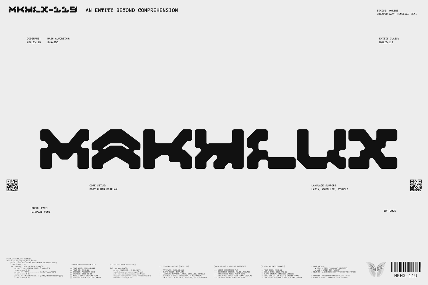
MAKHLUX 119 – Futuristic Typeface
MAKHLUX – A Cyber Mecha Display Typeface Inspired by Entities and Light from the Post-Human World A creature from the future. A light from digital ruins. MAKHLUX is a cyber-futuristic display typeface that fuses mecha aesthetics, post-apocalyptic atmosphere, and evolved machine language. Derived from the Indonesian word “makhluk” (meaning creature or entity) and the Latin word “lux” (meaning light), MAKHLUX is the typographic embodiment of a luminous entity born from the debris of the old world. It is a synthetic lifeform — a fusion of organic and mechanical, of human language and machine code. With sharp, angular, and geometric letterforms, MAKHLUX emerges as a digital artifact from a vanished era — a visual creature ready to invade your creative projects with power and mystery. Ideal for cyberpunk themes, sci-fi visuals, tech-noir branding, mecha animation, and dystopian video game aesthetics. The Meaning Behind MAKHLUX 🧬 “Makh” (from Makhluk, Indonesian) — A living entity or conscious being that exists between reality and the digital realm. 💡 “Lux” (Latin) — Light; symbol of energy, hope, and existence in digital darkness. 🤖 MAKHLUX — A digital creature of light, a post-human entity born within ruins and algorithms. Why Choose MAKHLUX? ✅ Cyberpunk Typography Entity – Designed to deliver a futuristic, glowing darkness of dystopian worlds. ✅ Signature Letters: A, H, M, L – Bold, standout shapes designed to anchor your display compositions. ✅ Mecha + Dystopia Style – Perfect for sci-fi posters, synthwave album covers, anime intros, or game UI. ✅ Cyber Futuristic Aesthetic – Angular, edgy, techy shapes that feel like messages from another dimension. ✅ Typeface as Lifeform – MAKHLUX is more than just a font — it's a living being that speaks through form. MAKHLUX isn’t just a tool — it’s a digital entity that brings language to life in new shapes. Let your words evolve into creatures, and those creatures emit light from the future.
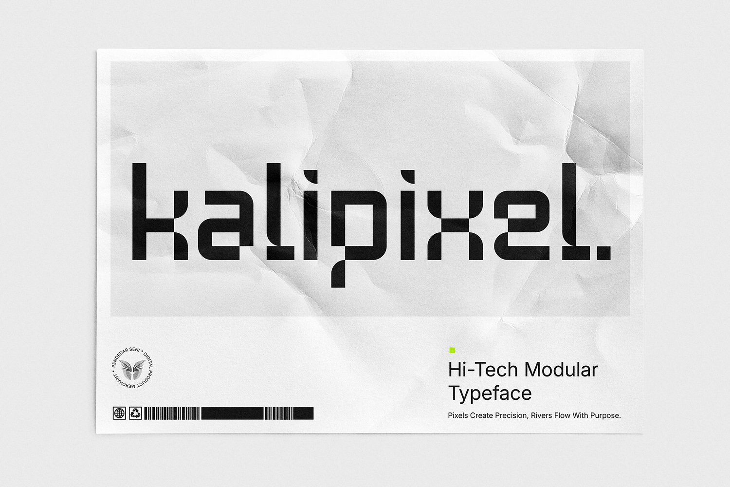
Kalipixel – Futuristic Typeface
Kalipixel – Minimalist Futuristic Display Typeface Kalipixel is a high-tech modular typeface that merges organic fluidity with geometric precision, creating a modern, sleek, and futuristic aesthetic. Designed for tech branding, esports, UI/UX, gaming, cyberpunk visuals, and digital innovation projects, this font embodies the essence of cutting-edge design. The Meaning Behind Kalipixel The name Kalipixel represents the fusion of two core elements: "Kali" (Flow & Adaptability) – Inspired by the seamless movement of a river, its rounded edges symbolize flexibility and innovation in typography. "Pixel" (Digital Structure & Precision) – As the building block of digital visuals, pixels define clarity, modularity, and structured form. This combination results in a bold, future-forward typeface—ideal for brands, creators, and designers who want to make a powerful, tech-driven impact. ✅ Why Choose Kalipixel? Futuristic & Modular Design – Perfect for branding, tech startups, gaming, and digital media. Balanced Rounded & Geometric Aesthetic – A unique blend of smooth curves and pixel-inspired sharpness. Full Character Set – Includes uppercase, lowercase, numerals, punctuation, and symbols. Multilingual Support – Covers Latin, Cyrillic, and special characters. Versatile & Scalable – Ideal for logos, UI/UX design, digital interfaces, and futuristic visuals. Highly Legible & Sharp – Optimized for headlines, posters, esports branding, and display text. Embodying the Future – A minimalist yet innovative font that resonates with modern typography trends. Kalipixel is more than just a typeface—it’s a statement of modernity, technology, and digital evolution. 🚀 Pixels Create Precision, Rivers Flow With Purpose.
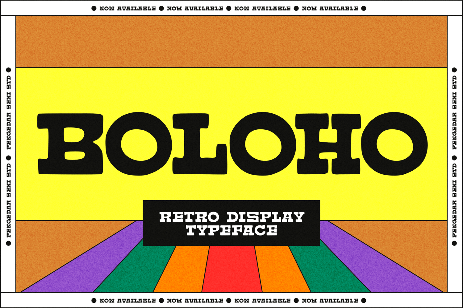
Boloho – Retro Display Typeface
Boloho – Retro Bold Display Typeface Unstable by Design, Retro by Heart. Boloho is an ultra-bold display typeface that captures the raw, unpolished charm of vintage typography. With its unstable, hand-crafted aesthetic, Boloho rejects rigid precision, embracing a natural imperfection that brings warmth and character to any design. Whether for posters, branding, headlines, or retro-inspired visuals, this font delivers a nostalgic yet rebellious statement. The Meaning Behind Boloho The name Boloho represents a fusion of strength and imperfection: 🌀 "Bolo" (Bold & Unapologetic) – A nod to its extreme thickness, making a loud, confident impact. 🔄 "Ho" (Organic & Freeform) – Reflecting the font’s unrefined, slightly irregular strokes, as if drawn by hand to preserve a vintage essence. Boloho defies traditional display fonts by embracing slight distortions, mimicking the charm of old-school print designs where ink bleed, rough edges, and human touch created personality in every letter. Why Choose Boloho? ✅ Ultra-Bold Retro Aesthetic – Perfect for vintage-inspired branding, posters, and statement typography. ✅ Unstable Yet Intentional Design – Irregular strokes create a raw, handmade feel without sacrificing readability. ✅ Authentic 70s & 80s Vibes – Inspired by old signage, magazine ads, and classic hand-drawn typography. ✅ Perfect for Headlines & Logos – Commands attention while maintaining a nostalgic touch. Boloho is more than just a typeface—it’s a bold tribute to the imperfect beauty of retro design. Let your typography break the rules and embrace the art of imperfection. 🌀🔥
Remuria Futuristic Font
Remuria Typeface is a bold display type with a futuristic vibe. Simple in a good way and efficient with tight kerning making it a great choice if you want a future look to your design. Remuria would be perfect for Futuristic Headline, Tech Theme, titles, logos, clothing brands, IT Website (landing page), and sci-fi film projects. Remuria has a concept : Futuristic/Dystopian/Brave/Domination/Balanced 2 Style Bold Outline FEATURE : TTF/OTF WOFF/WOFF2 Uppercase and lowercase Numbering and Punctuation Basic Latin Advanced Latin Works on PC or Mac
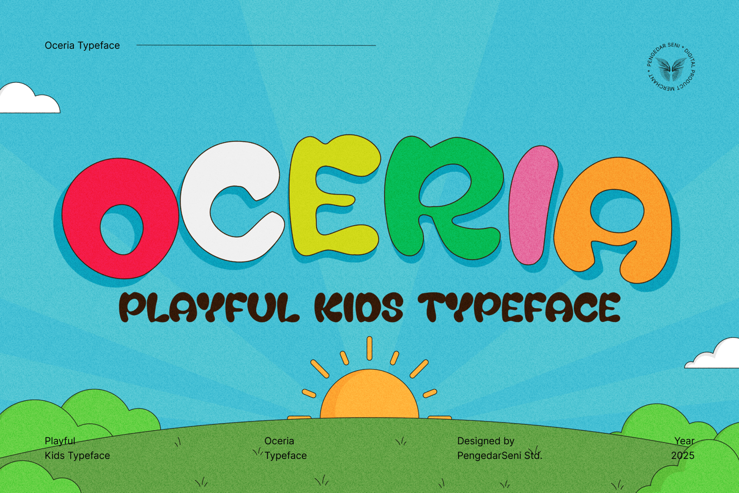
Oceria – Playful Kids Typeface
Oceria – Playful Kids Typeface Bright Smiles, Bold Letters, Endless Fun! Oceria is a cheerful and playful typeface designed to capture the joy and imagination of childhood. The rounded “O” symbolizes friendliness and warmth, while "Ceria"—taken from the Indonesian word for "cheerful"— embodies happiness and excitement, making it the perfect font for kids' projects. 🎨 Why Choose Oceria? ✅ Whimsical & Playful Design – Crafted for fun, energetic, and child-friendly themes. ✅ Bold & Readable – Easy to read while maintaining a lively personality. ✅ Full Character Set – Includes uppercase, lowercase, numerals, and punctuation. ✅ Versatile Usage – Ideal for kids’ logos, social media, book covers, packaging, and more. Oceria brings a world of imagination to your designs-where creativity and joy shine in every letter! ✨
WHY CREATORS CHOOSE PENGEDAR SENI
Building reliable digital tools for agencies, studios, and independent designers since 2015.
100% COMMERCIAL READY
All digital assets pass rigorous technical audits & clear legal licensing definitions for global corporate deployment.
DIRECT AUTHOR SUPPORT
Get direct technical support & glyph customization from the original type designers and software authors.
CUSTOM SERVICE & BRANDING
Need bespoke custom fonts, 3D illustrations, or specialized Adobe scripts? We craft custom solutions for your studio.
LIFETIME ASSET UPDATES
Enjoy free lifetime updates, bug fixes, and expanded glyph weights for all purchased font families & tools.
From Personal Use to Worldwide Enterprise Broadcasts.
We provide structured licensing tiers tailored for freelancers, agencies, and large corporate entities. No hidden terms.
COMMON INQUIRIES & LICENSING ANSWERS
Got questions about licenses, corporate invoices, or custom orders? Find answers below.